Los Angeles Football Club
Los Angeles sport fans should be getting pretty excited as a lot of sport news is brewing in city. It looks like at least one NFL team will be moving there and a second MLS team, the Los Angeles Football Club (LAFC), will be joining the league and city in 2018. Backed by a star-studded ownership group that includes Magic Johnson, Will Ferrell, Mia Hamm, and Nomar Garciaparra, LAFC promises to be a major force in the global game.
The club's branding was designed by Matthew Wolff Design.
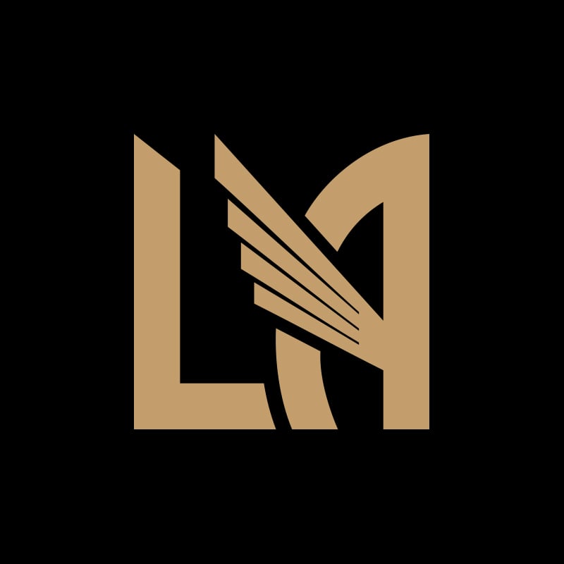
My initial reaction was "What's that fish fin doing in there?" But after a couple looks, it started to grow on me. Being it the 'City of Angels' and since the Anaheim Angels already own the halo, a wing seems like the right element. However, angels and wings are a hard thing to own while still giving a tough sporty vibe. I like that the city's Art Deco influenced the mark and the type. I also like the gold color they chose. To me, this is gold. I hate when the Lakers are referred to as Purple & Gold. Nope, that's yellow. (Sorry Laker fans.)
“
We chose a single wing to be the centerpiece of the crest. It is the perfect symbol to represent the City of Angels, and is grounded in historical and multicultural significance. A universal symbol of speed, power, and mobility, the wing is a legendary icon which appears consistently throughout history and across cultures.”
What I like most about this logo is that it doesn't hit you over the head with a sporty look. Everything is a bit unconventional in what most sport fans are used to seeing. For example, no soccer balls forced into the lockup. This is a great step in sports branding. I'd rather see a team stand behind a mark rather than be clever because they snuck a ball into some negative space.
Let's be honest. This won't be replacing the iconic LA Dodgers logo any time soon but it has a lot of legs (or should I say wings?) and I can imagine a lot of young soccer fans rocking this hat. I'm very curious to see what the uniforms will look like - especially the numbers on the back.


